
The maturity of the digital market has reshaped the way technology teams build interfaces. Today, delivering a visually pleasing layout is no longer enough: it is necessary to create systems capable of guiding decisions, reducing mental effort, and keeping users in control. Intuitive Design emerges as a strategic and indispensable approach in this context, balancing human behavior, engineering, information architecture, and cognitive efficiency to create experiences that work without friction and sustain performance in complex environments.
As projects become denser and competition for attention increases, the operational clarity of an interface becomes decisive for essential metrics. An intuitive interface and a comprehensible flow reduce errors, accelerate journeys, lower abandonment rates, increase trust, and improve indicators that directly influence organic positioning. For companies operating advanced digital solutions, understanding Intuitive Design is a mandatory requirement.
In this content, you will find a detailed, applied, and up-to-date analysis of the pillars of this approach and its concrete impact on SEO, Core Web Vitals, and digital product efficiency. This article was developed for professionals who want to elevate the strategic level of their projects, without superficiality or oversimplification.
Request a technical consulting session with Dexa
Pillars of Intuitive Design and their real-world impact
Intuitive Design is built on foundations that directly influence the fluidity of the experience. Below, we present how each pillar is explored in depth, with practical applications and examples that can be immediately observed.
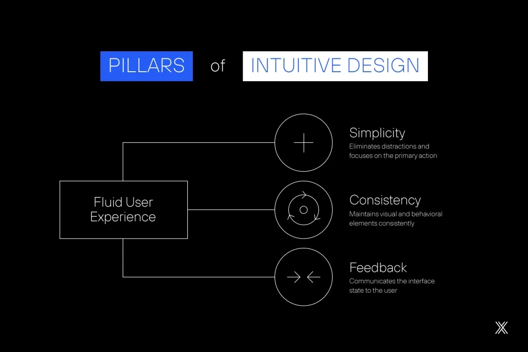
Function-oriented simplicity
Simplicity is not aesthetic minimalism; it is the rigorous elimination of anything that distracts or competes with the primary action. A simple interface is one in which the user’s task becomes evident, regardless of the level of complexity of the system behind it. Function-oriented simplicity makes intent clear, even when the underlying system is complex.
Clear examples of application include:
Registration screens that group steps by intent, reducing anxiety.
Forms that hide advanced fields until they are actually necessary.
Dashboards that display only action-driving metrics, rather than everything that can be measured.
Product pages that highlight decisive information before any technical details.
Effective simplicity does not empty content; it organizes, prioritizes, and guides.
Consistency that creates recognition
The human mind depends on patterns. When visual and behavioral elements repeat coherently, users build a kind of mental map of the interface. This recognition reduces effort, speeds up decisions, and decreases errors. Consistency allows users to anticipate behavior instead of interpreting the interface repeatedly.
In practice, this includes:
Components that preserve position, color, and behavior throughout the site.
Microinteractions with predictable responses, such as hover, click, or scroll behavior.
Navigation that maintains a unified logic, even across different areas of the product.
Grid systems and typography that avoid the perception of disconnected pages.
Well-executed consistency generates silent confidence.
Feedback that guides and confirms
Users need to feel that the interface responds to their actions; feedback is functional communication. When the interface clearly indicates that something has been sent, saved, processed, or blocked, it reduces uncertainty and improves the rhythm of the experience. Clear feedback reinforces control and prevents hesitation.
Key observations include:
Notifications that explain success and error states without ambiguity.
Loading indicators that communicate what is happening.
Real-time validations that allow immediate correction.
Visual changes after critical actions, such as deletions or confirmations.
Effective feedback reduces rework, avoids frustration, and reinforces user control.
See also: User Experience Design and its visible impact on the digital market
Intuitive Design, SEO, and Core Web Vitals: a direct and decisive relationship
At first glance, design and SEO may seem like independent disciplines. In practice, they become inseparable when we analyze user behavior alongside Google’s evaluation model. The search engine has begun to measure experience as a ranking factor, which means the interface has become a central element of organic visibility strategies. User experience is now a measurable signal for search relevance.
Below, we provide a concrete deep dive into how Intuitive Design impacts Core Web Vitals and other essential indicators.
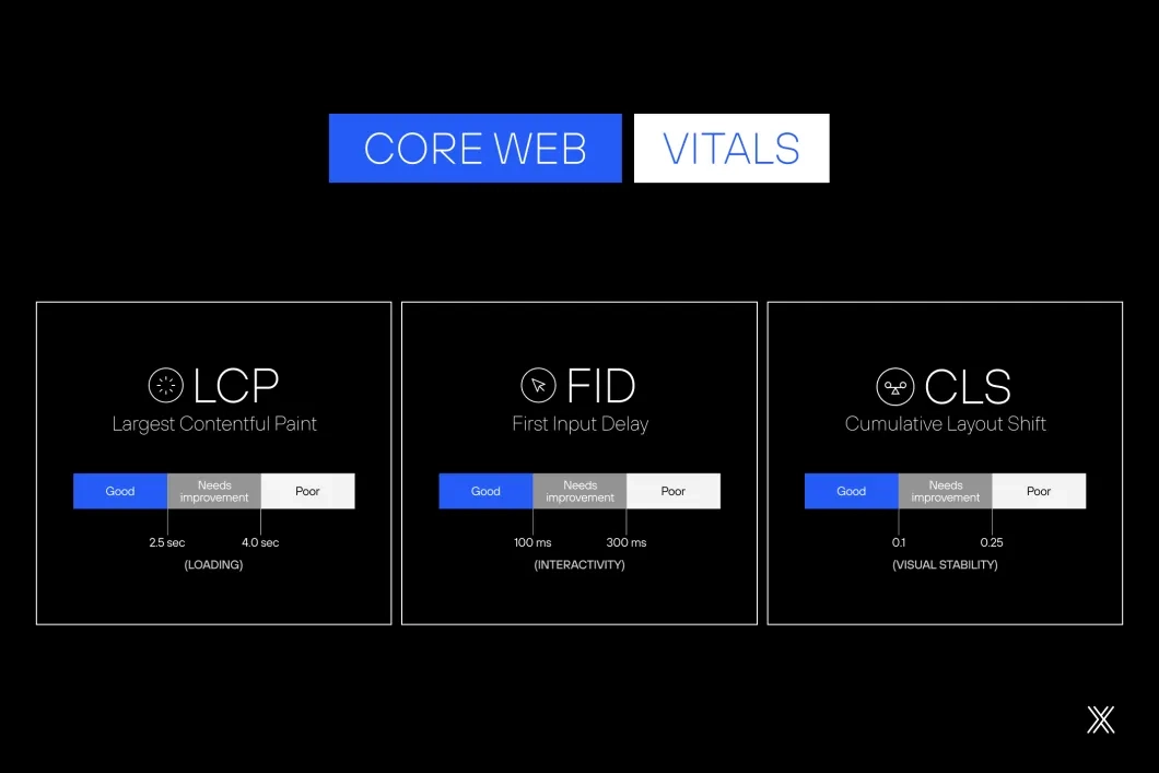
Efficient loading and structural simplicity
A simple interface requires fewer resources, which reduces page weight and improves Largest Contentful Paint (LCP). Google prioritizes pages that load the main element quickly and stably. The more direct the visual structure, the more efficient the loading process becomes.
Visual stability and consistency
Unexpected layout shifts disrupt reading and negatively affect Cumulative Layout Shift (CLS). Intuitive Design promotes stable hierarchy, predictable components, and consistent behavior. This approach prevents jumps, displacements, and late visual adjustments.
Fast interactivity and clear architecture
Intuitive interfaces reduce unnecessary interaction layers. Fewer elements competing for attention result in lower impact on Interaction to Next Paint (INP), delivering more natural responses with fewer perceived delays. Clear architecture directly improves perceived responsiveness.
Retention and time on site
When users understand an interface quickly, they navigate with more confidence, explore more sections, consume more content, and reduce the likelihood of early abandonment. For algorithms, this behavior is interpreted as relevance. Comprehension drives engagement signals that influence rankings.
Declarative navigation and crawlability
A clear interface facilitates internal link distribution and improves how crawlers understand site structure. This increases navigational predictability, improves indexation, and reinforces topical authority. Structural clarity benefits both users and search engines.
The combination of these factors makes Intuitive Design a central element of organic visibility strategies. It strengthens both experience and technical performance. Usability and SEO converge into a single performance system.
Optimize your digital product. Talk to a specialist
How to apply Intuitive Design in projects
Intuitive Design stops being an abstract concept when it is applied with method. Below, you will find a set of strategic guidelines to implement this approach in an organizational and continuous way. Applying Intuitive Design requires structure, discipline, and long-term commitment.
Visual hierarchy that guides decisions
Organizing elements by relevance guides reading naturally and eliminates unnecessary effort. Hierarchy must be built with clear rules of scale, proximity, contrast, and rhythm. A well-defined visual hierarchy reduces ambiguity and accelerates decision-making.
Applications:
Visual emphasis on primary actions.
Intelligent use of spacing to separate blocks of information.
Semantic grouping of related content.
Headings that anticipate the function of the section.
Buttons whose size and position reflect real priority.
Hierarchy implemented correctly reduces doubts and speeds up task execution. Clarity in hierarchy directly impacts efficiency.
Accessibility as a structural foundation
Accessibility is not a feature, but a rigorous design criterion. Accessible environments expand reach, reduce operational barriers, and improve content comprehension by search algorithms. Accessibility strengthens usability, inclusion, and discoverability at the same time.
Direct applications:
Adequate contrast for reading across different devices.
Efficient keyboard-only navigation.
Text alternatives for visual elements.
Semantic structure that reinforces SEO.
Components with clear states for different interactions.
Strong accessibility generates interfaces that work better for everyone. Accessibility is a baseline, not an enhancement.
Read also: Why Inclusive Design is no longer optional?
Mobile-first as a discipline of prioritization
Designing for mobile devices forces teams to identify what is essential. This discipline removes redundancy, organizes flows, and prioritizes critical functionality. Mobile-first thinking turns constraints into strategic focus.
Objective points:
Most relevant content positioned at the top.
Touch elements with comfortable spacing.
Simplified menus.
Loading optimization.
Rational use of scripts and external resources.
Mobile-first is not about adaptation; it is about identifying what truly matters. Prioritization defines mobile-first success.
Minimizing cognitive load
The human brain processes information in blocks. When an interface overloads users with excessive stimuli, the user experience becomes slow and confusing. Reducing cognitive load is a fundamental practice of Intuitive Design. Lower cognitive demand leads to faster understanding and smoother interaction.
Strategies:
Screens that present only what is necessary for the current action.
Breaking long tasks into streamlined steps.
Standardized visual language.
Elimination of external distractions.
Proximity between related elements.
Less noise means more focus and greater clarity. Cognitive simplicity improves performance.
Affordance: elements that reveal their function
Affordance is the first fundamental principle of interaction. It uses universal references so users understand the purpose of each element without additional explanation. This predictability improves rhythm and reliability. Affordance allows users to act without hesitation.
Examples:
Buttons that truly behave like buttons.
Icons that reflect widely recognized patterns.
Clickable areas with clear boundaries.
Draggable elements that reveal their function through form.
Arrows that indicate content expansion.
When the interface reveals its function, the experience flows. Clarity of action sustains intuitive interaction.
Learn more about 'Digital Experience in practice and its impact on conversion'
Continuous validation to drive evolution
Even well-planned interfaces can display unexpected behaviors in real-world use. People interpret elements in different ways, which is why continuous validation becomes a structural part of product evolution. Real usage consistently reveals gaps that planning alone cannot anticipate.
This approach is grounded in a simple principle: observing real usage generates insights that do not emerge in controlled environments. From this point, continuous validation unfolds into complementary practices that work together to inform decisions and reduce uncertainty. Validation transforms design from assumption-based to evidence-driven.
These practices include:
Heuristic analyses to identify usability issues based on established criteria.
Moderated sessions that allow teams to observe user decisions, doubts, and shortcuts.
Remote testing, increasing scale and diversity of user profiles.
Navigation recordings that reveal behavior patterns and friction points.
Reading and interaction maps, such as heatmaps and scrollmaps, that show where attention is concentrated.
Hypothesis-based experiments, such as A/B testing, to validate decisions with data.
Continuous validation enables progressive, evidence-oriented adjustments, reducing risk and avoiding decisions based on assumption. This process keeps the product alive, adaptable, and aligned with changes in user behavior, technology, and expectations, preventing small issues from evolving into meaningful barriers to use.
Dexa and Intuitive Design in practice
Dexa operates with structured processes, technical rigor, and strategic vision to build intuitive, efficient, and sustainable digital experiences. The work integrates information architecture, engineering, research, data, and design into a continuous operation, without silos between teams. This integration ensures consistency, governance, and scalability from the ground up.
Our approach prioritizes strategic prototyping, short validation cycles, consistent visual standards, and performance from the foundation of each project. The experience is designed with accessibility, SEO, scalability, and governance treated as technical requirements, not as post-launch adjustments. Performance and evolution are considered from the first architectural decisions.
The result is clear, predictable digital products prepared to evolve, with interfaces that reduce friction, increase operational efficiency, and sustain long-term results. Intuitive interfaces become a structural asset for business growth.
Want to know how to apply this to your project? Let’s talk about your next step!