
For years, taking a layout from Figma to Drupal was a manual, time-consuming process filled with friction. Designers delivered flawless screens. Developers had to reinterpret every detail to transform them into Drupal components. Along the way, nuances were lost, decisions were revisited, and rework became the norm.
This scenario is changing with Drupal Canvas and its integration through the Model Context Protocol (MCP). It is now possible to generate functional components directly from design in minutes, not hours.
However, there is a critical condition that separates a productive workflow from automated chaos: the quality of the output depends directly on the quality of the input. AI does not perform magic. It interprets structure, naming, hierarchy, and intent. A well-prepared design produces predictable code. A disorganized design produces problems at record speed.
This guide brings together best practices that make the difference between a component that works on the first try and one that requires hours of refinement. The content is organized into three pillars:
Structure: how to organize design and code so they understand each other.
Communication: how to convey design intent to code.
Iteration: how to refine until you reach the ideal result.
Pillar 1 – Structure
How to organize Figma so Drupal Canvas can generate consistent components
Before discussing automation or AI, we need to discuss fundamentals. Structure is what allows design and code to align without excessive interpretation. When the foundation is solid, automatic generation works. When it is not, every component becomes a manual adjustment point.
Naming conventions that humans and machines can understand
Layer naming in Figma is one of the most decisive factors for successful automated component generation. AI uses these names to understand hierarchy, function, and relationships between elements. Generic names simply do not communicate intent.
Recommended pattern
Use the structure Component/Variant/State to name components, and descriptive names for internal layers.
Examples
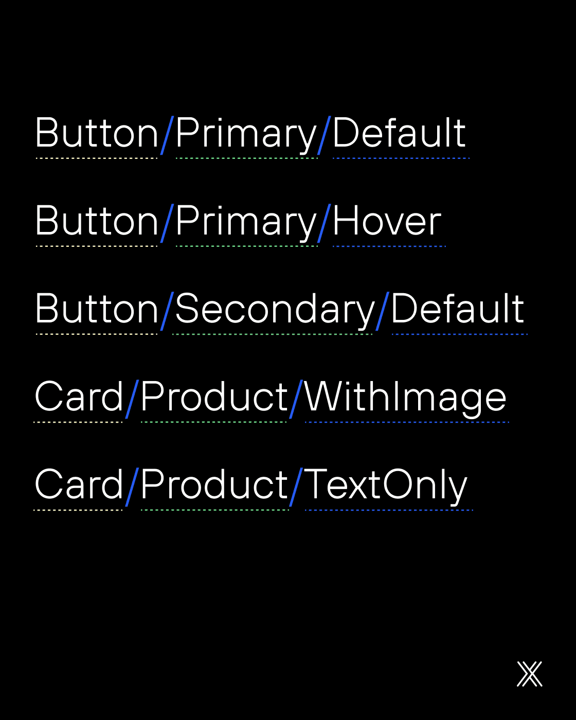
For layers inside the component

Conventions that improve interpretation
To reduce ambiguity, it is essential to adopt simple and consistent conventions. These conventions help both the people maintaining the file and the AI interpreting the design.
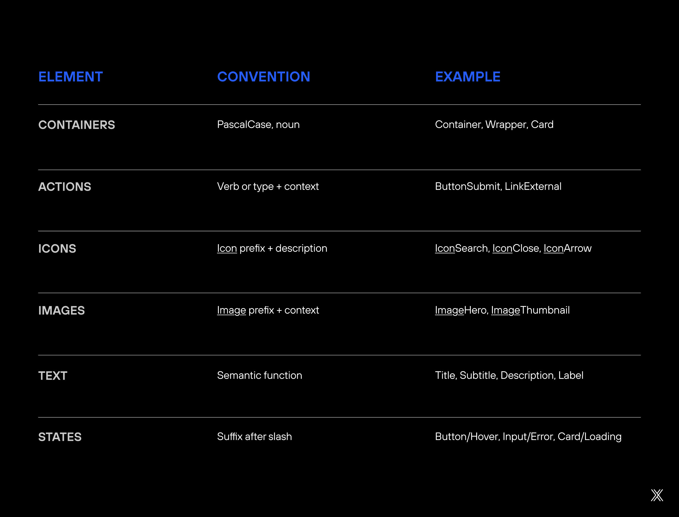
What to avoid
Even well-designed interfaces can fail in automated generation due to structural mistakes. Below are the most common issues and why they matter.
Duplicate names: When two layers share the same name, AI cannot correctly distinguish the role of each element. This often results in incorrect style mapping, props applied in the wrong place, or a confusing HTML structure.
Special characters: Accents, spaces, and symbols complicate name normalization and tend to generate inconsistent classes and props in the code. To avoid issues, use only camelCase or PascalCase, without special characters.
Overly long names: Long names often mix multiple responsibilities into a single layer, making automatic interpretation more difficult. Instead, keep the base name simple and use Figma variants to represent states, sizes, and visual variations.
Obscure abbreviations: Abbreviations reduce semantic clarity and increase the risk of misinterpretation by AI. Prefer full, descriptive names that clearly communicate the element's function.
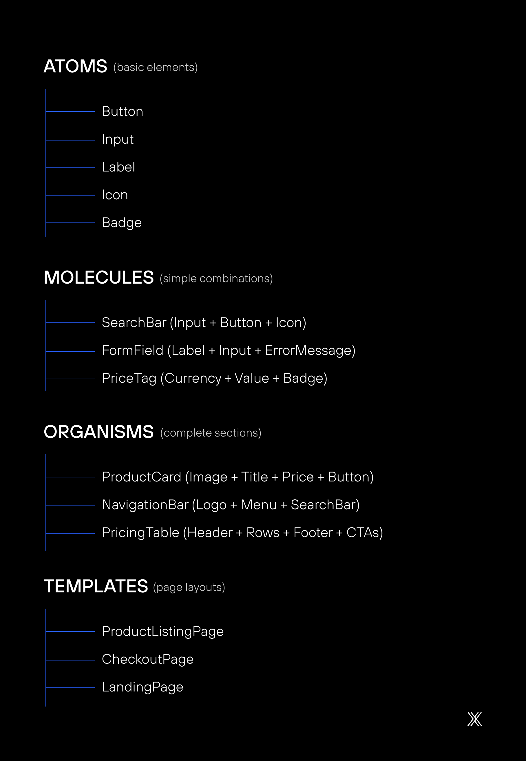
Component architecture
The way you structure components in Figma should mirror how they will exist in Drupal Canvas. This means thinking about reuse from the start and avoiding turning every screen into a unique, isolated artifact.
Here, Atomic Design helps maintain a healthy hierarchy.
A hierarchy that works:
When to create a component vs. a variant
Before defining any component in Drupal Canvas, it is essential to distinguish what truly requires a new structure from what can be solved with controlled variations. This decision directly impacts reuse, maintenance, and the clarity of the component system. Creating too many components fragments the design system. Creating too few creates rigid structures that are difficult to evolve.
The table below helps guide this choice, showing when to opt for a variant and when it makes more sense to create a new component.
Situation | Decision | Rationale |
|---|---|---|
Same layout, different colors | Variant | Identical structure, only style changes |
Same layout, with or without image | Variant | Same structural base, optional element |
Completely different layouts | New component | Different structure requires a distinct component |
Mobile version vs. desktop | Variant | Same component with a different breakpoint |
Product card vs. blog card | New component | Props and usage context are significantly different |
Internal structure expected by Canvas
In Drupal Canvas, components work with props, which are configurable data, and slots, which are flexible composition areas. Your design needs to reflect this, because this is one of the aspects that most directly affects component reuse.
Conceptual example of a component in Canvas:
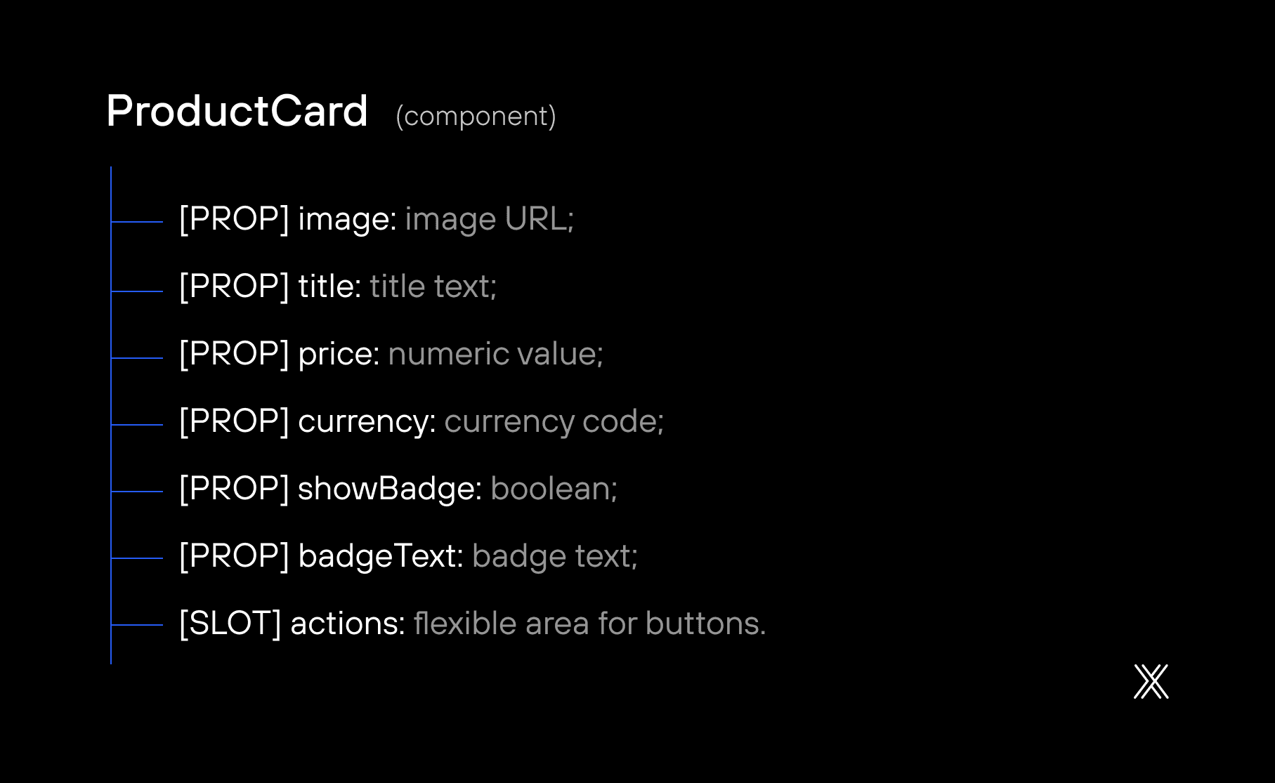
How to reflect props and slots in Figma
In Figma, visually identify what is a prop and what is a slot using naming conventions, colors, or layer prefixes.

Design tokens as a single source of truth
Design tokens are variables that represent design decisions such as colors, typography, spacing, and shadows. They ensure consistency between Figma and Drupal.
Why tokens make a difference
Without tokens, small inconsistencies accumulate over time. With tokens, changes are centralized, predictable, and scalable. They reduce errors, simplify maintenance, and align design and development.
Recommended token structure
Tokens are organized into two layers.
Primitive tokens are base values such as colors, spacing, and fonts.
Semantic tokens represent usage intent, such as primary color, background, text color, or component spacing.
This separation allows the design to evolve without breaking existing contracts.
Recommended token structure example

Token flow into Drupal
Creation in Figma using tools such as Tokens Studio
Export to JSON
Transformation using tools such as Style Dictionary
Generation of CSS variables
Direct consumption in Canvas components
Pillar 2 – Communication
How to translate intent from Figma into clean CSS in Drupal
Structure defines what. Communication defines how. Even a well-organized design can generate confusing code if behavior is not clearly defined.
In this pillar, the focus is on ensuring that AI can interpret how elements should behave, not just how they look.
Auto Layout in Figma: How it becomes flexbox and grid
The way you build layouts in Figma directly determines the quality of the generated CSS. Auto Layout is the key, but not just any Auto Layout.

Practical example: product card built with auto layout
In Figma (layer structure using Auto Layout):

Expected generated CSS:

The idea is simple. When the layout is logical in Figma, the CSS becomes predictable. AI does not need to guess intent. It translates it.

Responsiveness: What to define in Figma vs. in code
To avoid components that look good in only one breakpoint, combine correct decisions in Figma with precise adjustments in code.
Define in Figma
Resizing behavior such as Fill, Hug, or Fixed
Proportions and relationships between elements
Main breakpoints as separate frames, such as Mobile, Tablet, and Desktop
Which elements disappear or appear at each breakpoint
Adjust in code
Exact media queries
Specific breakpoint values
Transition animations
Overflow and scroll behavior
Clear communication between design and code prevents AI from making assumptions. When intent is explicit, the generated CSS remains clean, scalable, and aligned with the design system.
Documentation in Figma
Figma's description fields are often ignored by designers, but they can influence generation. The idea is simple. When intent is written down, AI has fewer gaps to fill with assumptions.
Include in the description:
Purpose of the component
Props and their types
Slots
States
Accessibility requirements
Clear documentation reduces ambiguity and improves the predictability of generated components.
Explicit props, states, and default values
Use Figma's properties panel to define variants and their values.
Property | Type | Values | Default |
|---|---|---|---|
Size | Enum | small, medium, large | medium |
Variant | Enum | primary, secondary, ghost | primary |
State | Enum | default, hover, active, disabled | default |
ShowIcon | Boolean | true, false | false |
IconPosition | Enum | left, right | left |
The instructions file as a bridge
The .github/copilot-instructions.md file is where you document project-specific standards, including SDC structure, CSS patterns, and Twig or YAML conventions.
This file acts as a translation layer between design logic and implementation standards. It ensures that generation aligns with the architectural decisions of the project.
Visual Constraints That Prevent Fragile CSS
Some design decisions seem harmless but create long-term issues in code.
Best practices
Prioritize Auto Layout with gap
Avoid absolute positioning
Use Fill and Hug intentionally
Define fixed widths only when necessary
Limit text by the number of lines in the design
Common problems
Elements without a parent container
Negative margins used for alignment
Breakpoints without clear rules
Components that only work with specific content
Pillar 3 – Iteration
How to refine until you reach the ideal result
Even with a solid structure in Figma and clear communication of layout intent, the first output generated through Drupal Canvas will rarely be final. This is not a flaw in the process. It is a natural part of any component-driven workflow.
The difference between a team that becomes frustrated with automation and a team that scales with it lies in how iteration is handled. Good iteration does not mean fixing code. It means refining the input that generates the code.
In this pillar, the focus is on understanding how to evolve components in a controlled and predictable way without compromising system consistency.
Iterate by component, not by page
Testing directly within full pages often creates confusion. On a page, multiple components interact at once. When something breaks, it becomes difficult to trace the source. You do not know whether the issue comes from the card, the grid, the slot, the token, or a specific variant.
The ideal approach is to work in short, controlled cycles at the component level:
Generate an isolated component
Validate structure, props, and slots
Adjust the design in Figma if the issue is structural
Regenerate the component to confirm behavior
Only then use the component to compose pages
This method reduces the impact of errors because you fix the root cause before it spreads across the interface. It also accelerates learning, since each iteration produces clear feedback about what changed in Figma and how it appeared in Canvas.
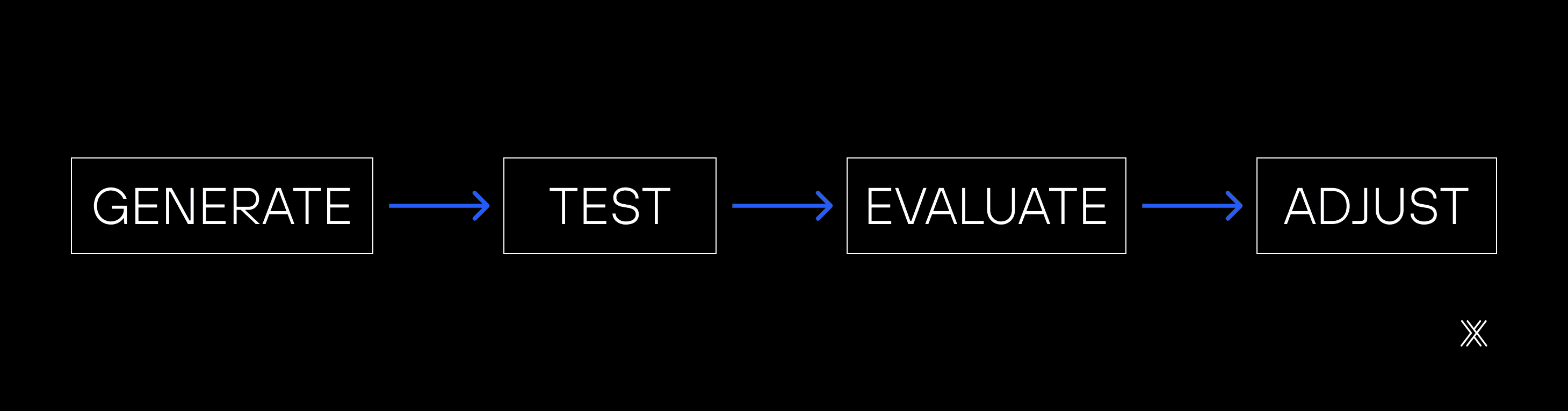
The Fast Feedback Cycle
An efficient workflow between Figma and Drupal Canvas depends on short, repeatable, and predictable cycles. The logic is simple: generate, test, evaluate, and adjust, without long intervals between each step. The shorter the cycle, the less rework.
1. Generate
Run component synchronization by providing the component name and the exact node URL in Figma. This step creates the base of the component in Canvas from the defined design structure.
2. Test
After generation, clear the cache and preview the component in the Canvas editor. The goal is not to validate aesthetics, but to confirm that the component renders correctly and is available in the environment.
3. Evaluate
Perform an objective technical quality check:
Semantic HTML structure
Consistent CSS class patterns
Use of CSS variables instead of fixed values
Props correctly mapped
Functional responsiveness
Interaction states implemented
Basic accessibility requirements met
4. Adjust
If something is not correct, refine and repeat the cycle.
Adjust in Figma and regenerate when the issue is structural, such as hierarchy or naming.
Adjust directly in code when the issue is isolated, modifying YAML, Twig, or CSS.
This cycle reduces late-stage corrections, keeps design and code aligned, and transforms component generation into a predictable, technical, and controlled process.
When the output is good enough
Pursuing absolute perfection can delay the project without delivering proportional value. In the Figma to Drupal workflow, the goal is not to eliminate every minor imperfection, but to ensure the component is solid, reusable, and consistent with the system. Knowing how to prioritize is what preserves speed without compromising quality.
Low-impact issues can be accepted or resolved with quick adjustments. Structural problems should be corrected in Figma and regenerated to prevent the error from spreading. Experience or accessibility issues, however, are non-negotiable and require immediate correction. This balance keeps the workflow healthy and productive.
Problem | Impact | Action |
|---|---|---|
CSS class with an odd name | Low | Accept or apply a quick manual fix |
Incorrect HTML structure | High | Adjust in Figma and regenerate |
Missing state such as hover | Medium | Add manually |
Props not mapped | High | Review the component description in Figma |
Broken responsiveness | High | Review Auto Layout in Figma |
Inconsistent spacing | Medium | Check tokens or adjust manually |
Designer and developer in sync
The Figma to Drupal workflow does not eliminate collaboration between design and development. It makes it more objective. Instead of long translation cycles and rework, the process focuses on quick validations and joint decisions based on the component's real behavior.
This proximity reduces noise, accelerates delivery, and creates shared understanding around technical constraints and design possibilities.
Establish a simple ritual:
The designer prepares the component in Figma following the agreed standards
The developer runs the generation and tests it in Canvas
Together, they review the result in a quick call lasting 15 to 30 minutes
They decide jointly whether to accept it, adjust in Figma, or adjust in code
This rhythm keeps iteration structured and prevents misalignment from accumulating.
Bidirectional Feedback: When code informs design
The workflow is not just Figma to Code. In many cases, code reveals limitations or opportunities that were not obvious in design. Auto Layout that does not generate consistent Flexbox, deeply nested hierarchies that produce complex CSS, or poorly defined slots that limit reuse are common examples.
When this happens, adjusting Figma does more than improve the current component. It improves the entire system that will be generated from it.
Shared documentation is the foundation of the process
For iteration to scale and not rely solely on team memory, it is essential to record decisions. A simple document in Notion, Confluence, or Google Docs is enough to support the process.
Document the component library and its status, agreed naming, token and structure standards, relevant technical decisions, and known issues with their solutions. This reduces rework and keeps the team aligned over time.
Common errors in the Figma to Drupal workflow and how to avoid them
Structural issues
When a component does not appear in Canvas, the cause is usually an uncleared cache. Overly generic HTML typically indicates layers without semantic names. Strange CSS is often the result of deeply nested hierarchies. Missing props almost always originate from incomplete descriptions in Figma.
Problem | Likely Cause | Solution |
|---|---|---|
Component does not appear in Canvas | Cache not cleared | Run |
Generated HTML uses generic div elements | Layers lack semantic names | Rename all layers in Figma |
CSS selectors look unusual | Layer structure too deeply nested | Simplify hierarchy to a maximum of 4 to 5 levels |
Props do not appear in the panel | Incomplete component description | Document all props in the Figma description |
Code issues
Hardcoded colors indicate the absence of tokens. Broken Flexbox behavior is usually a reflection of poorly configured Auto Layout. Failed responsiveness typically results from inconsistent use of Fill and Hug.
Problem | Likely Cause | Solution |
|---|---|---|
Hardcoded colors in CSS | Tokens not configured | Implement Design Tokens before generating |
Flexbox does not behave as expected | Auto Layout misconfigured | Verify that all containers use Auto Layout |
Broken responsiveness | Inconsistent constraints | Use Fill and Hug consistently and avoid Fixed |
Fonts not applied | Font stack not defined | Configure font-family in tokens |
Workflow issues
Irrelevant code generation usually points to a missing or incomplete instructions file. Recurring errors are common when prompts are too generic. Output that deviates significantly from the design often occurs when elements sit outside the component frame in Figma.
Problem | Likely Cause | Solution |
|---|---|---|
Copilot generates irrelevant code | Instructions file missing or incomplete | Add a detailed |
Constant generation errors | Prompt too generic | Break the process into smaller steps and validate structure first |
MCP does not connect | Server not started | Check Figma Preferences and enable Enable MCP Server |
Result very different from design | Elements outside the component frame in Figma | Ensure everything is inside the component frame |
Identifying these patterns early prevents small mistakes from turning into bottlenecks throughout the project.
Conclusion
The bridge between Figma and Drupal Canvas is not magic. It is a method. With clear structure, effective communication, and disciplined iteration, the promise of design-to-code in minutes becomes a practical reality.
The three pillars we explored form a virtuous cycle:
Well-defined structure facilitates communication
Clear communication accelerates iteration
Fast iteration reveals improvements in structure
Start small. Choose a simple component, apply the best practices, and observe the result. Adjust, learn, and repeat. In a short time, the workflow that once seemed complex becomes natural, and the distance between design and code finally disappears.
Important: This article was inspired by the pioneering work of Witze Van der Straeten, whose experimentation with Figma MCP and Drupal Canvas was presented at DrupalCon Vienna 2025 and drew the attention of Dries Buytaert, founder of Drupal.
Final Checklist
Before scaling the Figma to Drupal workflow, run through a simple checklist. It helps identify bottlenecks quickly and prevents small oversights from compromising the entire process.
For Designers
Layers are named semantically, without using labels such as Frame 1 or Group 2
Components following the Component/Variant/State pattern
Auto Layout applied to all containers
Design Tokens configured for colors, typography, and spacing
Component description filled with props and slots
Variants created for all states, such as hover, active, and disabled
Responsive versions organized as separate frames
Constraints configured consistently
For Developers
Environment configured with DDEV, Drupal 11, and Canvas
VS Code integrated with Copilot and MCP
The instructions file was created at
.github/copilot-instructions.mdTokens transformed and available as CSS variables
SDC folder structure prepared
Cache rebuild script ready for use
For the Team
Naming conventions documented and agreed upon
Component library status is always up to date
Joint review ritual established
A communication channel is defined for continuous feedback
Shared documentation accessible to everyone
This checklist works as a safety mechanism:
If everything is checked, the workflow tends to be predictable
If something fails, the issue appears early
Problems are resolved before turning into large-scale rework.


