
Picture spending months building a website, then watching visitors abandon the quote request form during launch week because the submit button ended up below the fold, or because the menu uses an internal service name customers have never heard. Problems like these rarely surface in approval meetings, since the people signing off know the product inside out. They surface when an outsider tries to complete a task without help.
The cost of that friction is measurable. Baymard Institute, which researches online store usability, documents an average cart abandonment rate of 70.22% and estimates that large e-commerce sites could increase conversion by 35.26% by fixing checkout design issues alone. On B2B websites, the same logic plays out under a different name: every confusing form or page that fails to answer a visitor's question is a sales opportunity that never reaches your sales team.
Usability testing is how you find those friction points while fixing them is still cheap. It shows how people actually use an interface, where they get stuck, and why. In this guide, you'll learn what it is, explore the 7 main types, see which method fits each project stage, and walk through running a test from planning to analysis.

What is usability testing?
Usability testing is a research method in which people from your target audience try to complete real tasks on a website, app, or prototype while the team observes what they do, where they make mistakes, and how they explain their own decisions. The focus is on observed behavior, which often differs from what the same people would report in an interview or opinion survey.
ISO 9241-11, the international standard for the ergonomics of interactive systems, defines usability as the extent to which a product can be used by specified users to achieve specified goals with effectiveness, efficiency, and satisfaction in a specified context of use. Each term turns into a test question: Did the person complete the task? How long did it take, and how many errors did they make? How did they rate the experience at the end?
The value of a test comes from the quality of what you learn, not the number of participants. Jakob Nielsen, co-founder of Nielsen Norman Group, showed that five users uncover most of an interface's problems and that a budget goes further across three small rounds, with fixes in between, than in a single large study. In a typical round, the team looks for answers to questions like these:
Can users find what they're looking for without help?
Do they understand how to complete key actions, such as requesting a quote, signing up, or accessing information?
What friction makes the experience slow, tiring, or confusing?
With those answers in hand, a company can fix bottlenecks while changes still cost little, usually at the wireframe or prototype stage, and reach launch with fewer untested assumptions.
Why is usability testing important?
The strongest argument is financial. Companies invest in design, infrastructure, and media, and a single interface detail can cancel out part of that investment: a poorly explained required field, an ambiguous menu label, a CTA that blends into a banner. Fixing this kind of problem after launch means redoing screens, rewriting code, and often getting content re-approved by legal and business stakeholders. Our guide to the ROI of UX explains how to translate that effect into metrics leadership tracks.
When testing is part of the process from the start, it pays off on several fronts:
Lower risk: Problems show up before launch, when fixing them costs less and doesn't expose the brand.
Conversion and ROI: Changes to information structure, CTA clarity, and form simplicity raise completion rates based on observed evidence.
Brand credibility: A predictable, easy-to-use website builds trust, especially in industries where visitors share sensitive data.
Fewer IT tickets: Tested flows generate fewer support requests tied to usage questions.
Autonomy for marketing: When testing includes internal content editors, the CMS gets validated too, and the team can publish pages and campaigns without relying on IT for basic tasks.
Stop losing customers to usability issues on your website
Dexa pinpoints where forms, menus, and CTAs block users and prioritizes fixes by business impact.
Usability, accessibility, and legal compliance
Accessibility is a legal requirement in a growing number of markets. In the United States, the Department of Justice's 2024 rule under the ADA requires state and local government websites and apps to meet WCAG 2.1 Level AA. In the European Union, the European Accessibility Act has applied to digital products and services such as e-commerce and banking since June 2025, and in Brazil, the Brazilian Inclusion Law (Lei 13.146/2015) makes accessibility mandatory on websites run by companies headquartered or represented in the country. The web is still far from compliant: the WebAIM Million 2026 report, which analyzes the home pages of one million websites, found detectable WCAG failures on 95.9% of them, with an average of 56.1 errors per page.
Low-contrast text (83.9% of pages) and missing form labels (51%) top the list. Automated tools flag these errors, but only testing with people who use screen readers or keyboard navigation shows whether a task can be completed end to end. Recruiting participants with disabilities brings usability and digital accessibility into the same validation round.
'An automated accessibility checklist catches contrast and alt text, but it won't catch a form that the screen reader announces out of order. That kind of problem only shows up when someone who uses assistive technology every day tries to complete the task in front of us.'
- Rafael Andrighetti, Head of Design at Dexa
The 7 types of usability testing
There's no single format for evaluating the usability of a website or app. The right method depends on project maturity, budget, and the question the team needs to answer, and larger projects often combine more than one. The seven types below are the most widely used on corporate websites.
1. Moderated usability testing
A researcher guides the participant, in person or over a video call, through a set of predefined tasks. The moderator can clarify questions and ask the user to think aloud, which reveals both what the person does and what they're thinking during the interaction. It's the best fit for prototypes and strategic launches, because it surfaces perceptions no metric can capture.
The advantage lies in the depth of the findings. Cost and time are higher, since each session requires an experienced facilitator and a setup for observing and recording.
2. Unmoderated usability testing
Participants complete tasks on their own, using platforms that record screen, audio, and clicks. This format lets you test with more people in less time and at a lower cost per session, which makes it useful for validating specific changes or comparing versions.
The limitation is the lack of intervention: when a participant gets stuck or misreads an instruction, nobody is there to find out why. Poorly written tasks can compromise the entire round.
3. Usability benchmarking
A summative method in which metrics such as success rate, time on task, number of errors, and satisfaction are collected in a standardized way. A common instrument is the System Usability Scale (SUS), a 10-item questionnaire with a benchmark average of 68. The goal is to compare the website against itself over time, or against competitors, and prove that a change led to improvement.
The data is solid enough to support investment decisions, but it demands methodological rigor: tasks, participant profiles, and conditions have to stay the same for rounds to be comparable.
4. Tree testing
Focused on information architecture, tree testing evaluates whether users can find content by navigating only a text version of the menu, organized as a tree with no visual elements. The method measures label clarity and grouping logic on websites with a large number of pages, such as corporate and service portals.
Its main advantage is catching structural problems before any screens are designed, which reduces rework. It's often paired with card sorting, which helps define the groupings, and it doesn't replace later testing with the actual interface.
5. Heuristic evaluation
Experts inspect the interface against established principles, such as Jakob Nielsen's 10 usability heuristics, published in 1994 and still in use today. The method is fast, low-cost, and requires no recruiting, which makes it a good starting point for an assessment.
The quality of the results depends on the evaluators' experience. A heuristic evaluation points to likely problems, and user testing confirms which ones actually get in the way.
6. A/B testing
A/B testing compares two or more versions of a page or flow, splitting traffic randomly between them, to measure which performs better on a defined metric such as conversion or form completion. It's the right method for choosing between alternatives once the website is live.
It works best on high-traffic pages, such as e-commerce sites and campaign landing pages, and it requires statistical planning. An A/B test shows which version won, but not why, and that answer comes from qualitative methods.
7. Eye-tracking and heatmaps
These techniques show how users distribute attention and interaction across a page. Eye-tracking follows eye movement in a lab setting, while heatmaps, generated by tools such as Hotjar, Microsoft Clarity, and Crazy Egg, record clicks, scrolling, and ignored areas on the live website.
They don't replace task-based testing, but they reveal whether the most important elements are getting noticed and flag where a moderated test is worth running.
How to choose the right type of usability testing for each project stage
The choice gets simpler when you start from the question the team needs to answer at that moment. Before there's a layout, the question is about structure. Once the website is live, the questions become where you're losing users and whether a change worked. The table below maps stage, question, and method.
Project stage | Core question | Recommended methods | Limitation to keep in mind |
Information architecture | Do the menu labels and groupings make sense to users? | Tree testing, card sorting | Doesn't evaluate layout, content, or interaction |
Wireframe and prototype | Do the main flows work without help? | Moderated prototype testing, heuristic evaluation | The prototype doesn't reproduce performance or real data |
Pre-launch | Do critical tasks work end to end, including with assistive technology? | Moderated or unmoderated testing in staging, screen reader testing | Requires a stable environment and well-written tasks |
Live website | Where are we losing users, and did the change improve results? | Heatmaps, A/B testing, SUS benchmarking | Shows what happens, but not why |
The most productive approach combines both sides: a quantitative method to locate the problem and size it, and a qualitative one to understand the cause. A heatmap showing drop-off at the third form field tells you where to look; five moderated sessions explain whether the problem is the label, the validation, or the question itself.
How to run a usability test, step by step
The details vary by method and project stage, but every well-run test goes through six steps. Most weak results come from mistakes in the first two, not from the session itself.
1. Define the goal and metrics
Start with the decision the test will support: approving a new architecture, choosing between two sign-up flows, prioritizing fixes before launch. Then choose your metrics. The most common are task success rate, time on task, number of errors, and a satisfaction measure such as the System Usability Scale (SUS).
2. Recruit participants who represent your real audience
Participants should match the people who use the website, not the people who build it. Colleagues from other departments know the company's vocabulary, which hides exactly the language problems you need to find. For qualitative studies, Nielsen Norman Group recommends five participants per round; when the website serves distinct audiences, such as patients and physicians, include three or four people from each group. Quantitative studies, such as benchmarking, call for about 20.
3. Write realistic tasks
Good tasks describe a goal, not a path. 'Find an in-network cardiologist near you' tests navigation; 'Click Provider Directory and filter by specialty' only tests whether someone can follow instructions. Avoid using the same words that appear on buttons and menus, because that gives the answer away.
'We review the task script as carefully as we review the layout. When a task repeats the button label, the participant just scans the screen for that word, and the session turns into a word search that tells you nothing about navigation.'
- Rafael Andrighetti, Head of Design at Dexa
4. Run the sessions
In moderated tests, the facilitator presents the tasks, asks the participant to think aloud, and holds back from helping, even when the participant gets stuck. Record screen and audio, and have another team member take notes so the facilitator can focus on guiding the session. In unmoderated tests, run a pilot session before opening the round: one ambiguous instruction invalidates every session that follows.
5. Analyze and prioritize by severity
Cross-reference quantitative data (time, success, errors) with qualitative data (comments, hesitation, signs of confusion). Rate each problem by severity, based on how many participants it affected and whether it blocked the task or only slowed it down. The final list has to fit into the next sprint, not into a report nobody will read.
6. Iterate and test again
Adjust the product and run another round to confirm the fix solved the problem without creating a new one. This short, evidence-based cycle is what separates a UX culture from a one-off test.
Many companies struggle to sustain this process because they lack people with research experience. On small teams, recruiting and analysis compete with day-to-day deliverables. In those cases, a partner specialized in UX analysis speeds up the cycle and brings method to the first rounds.
The best usability tests for corporate websites
A high-volume e-commerce site has different needs from a corporate portal or a financial services website. On corporate websites, choosing a method depends on the project stage, how regulated the industry is, and how many audiences the website serves at once.
Quick prototype testing for redesigns
In website redesign projects, testing navigation structures on interactive wireframes shows whether users can find key information before design and development eat up the budget. Tree testing comes first, while the menu is still under discussion, and moderated prototype testing validates the flows afterward.
Continuous testing in complex, regulated environments
Healthcare, financial services, and education websites bring together many audiences, a large volume of content, and accessibility and privacy requirements. In these environments, a single round before launch isn't enough: periodic unmoderated tests and an annual benchmark with the same tasks show whether the experience holds up as new pages and services go live.
A/B testing for conversion
Companies that depend on conversion rates, such as online retailers and B2B SaaS businesses, benefit from A/B testing at critical points in the flow. Comparing two versions of a sign-up form or checkout shows which one reduces abandonment, and small changes tend to produce meaningful gains when traffic is high. A high-converting website is the result of this kind of continuous adjustment.
In-person evaluations for critical decisions
Though more expensive, in-person tests are still recommended when a project involves high-impact changes or strategic audiences. On a public services portal or a digital bank, observing users in a lab reveals accessibility, trust, and security details that rarely surface in a remote session.
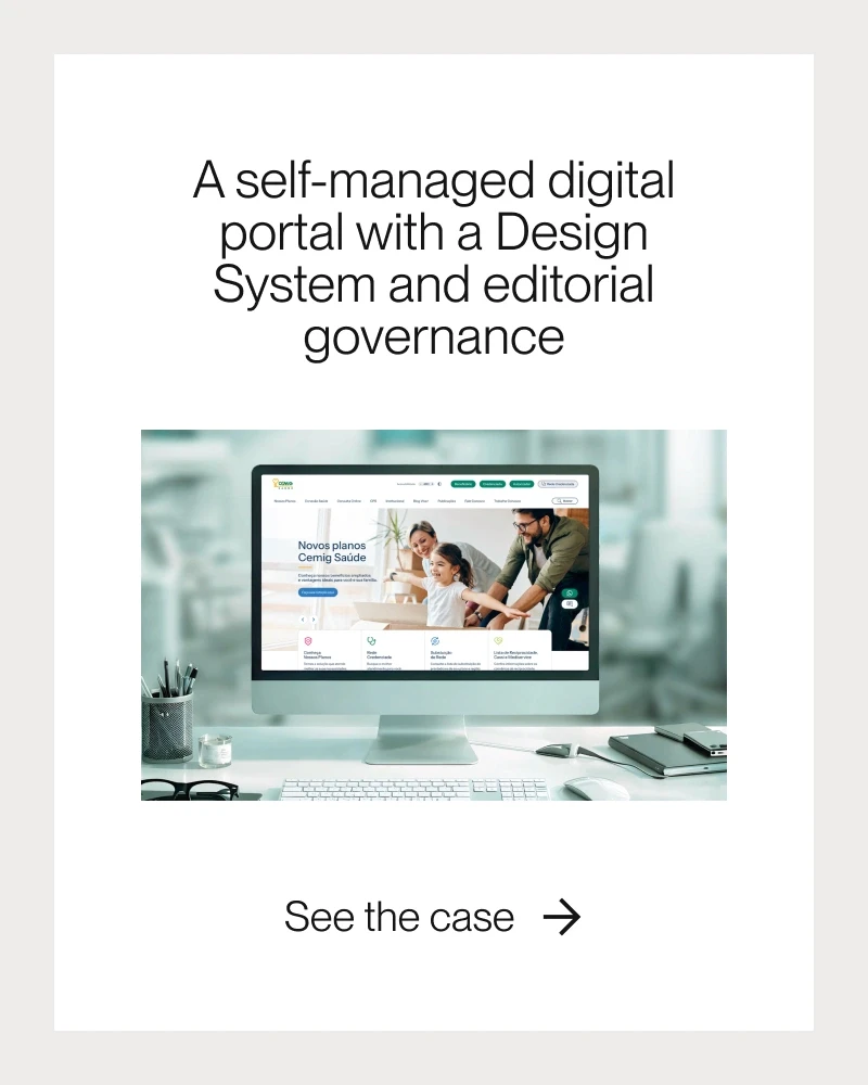
Cemig Saúde's portal and usability for two audiences
When Cemig Saúde, the health plan provider for Brazil's Cemig Group, came to Dexa, its portal ran on a proprietary tool that held back its evolution. The migration to an open platform had to preserve legacy URLs and organic rankings with no room for downtime, and it had to give marketing the autonomy to publish without filing an IT ticket.
The project addressed usability on two fronts. For health plan members, the goal was a responsive, accessible experience that brought forms, chat, the ombudsman channel, and the provider network into a single environment, securely connected to the APIs for healthcare services and to Cemig's corporate platforms.
For the internal team, Dexa built a design system integrated with the CMS, with reusable, documented components. Time to publish new content dropped by 70%, new features shipped 60% faster, and front-end costs fell by 50%, with 100% visual consistency across the portal.
'The new portal didn't just meet our initial expectations, it surpassed them,' says Eduardo Luiz de Abreu Gonzaga of Cemig Saúde.
The case highlights a point that often gets left out of testing: content editors are users too, and a CMS that's hard to operate produces inconsistent pages for members. The full Cemig Saúde case study details the migration and editorial governance.


Common challenges in applying usability testing
The most frequent barriers have little to do with technology. They come from organizational culture, a lack of research experience, and competing priorities on the project timeline.
Cost and time: In-person formats and large studies strain the budget, but launching without testing usually costs more in rework. A remote round with five participants is a viable starting point for almost any project.
Unrepresentative participants: Testing only with similar profiles, or with employees, skews the results. Recruiting should cover age, digital literacy, device, and people with disabilities, based on the website's real audience.
Internal resistance: Teams believe they already know the problems. Showing recorded clips of users getting stuck on a task tends to convince stakeholders faster than any report.
Pressure for speed: Skipping tests to meet a deadline pushes errors past launch. Fast methods, such as heuristic evaluation and short unmoderated tests, fit within sprints.
Overreliance on automation: Analytics tools, heatmaps, and AI-assisted analysis speed up data review, but they don't replace human interpretation of why someone hesitated. Balancing quantitative data with qualitative observation remains essential.
Why include usability testing in your next digital project
Launching a website without usability testing is like opening a store without checking whether customers can find the door. The problems testing uncovers are rarely major technical failures; they're labels, fields, and paths that make sense to the people who built the website and confuse everyone arriving for the first time.
Finding them at the prototype stage costs a fraction of fixing them on a live website, and what you learn in each round improves the decisions that follow.
For companies planning a redesign or already seeing drop-off in forms and critical journeys, Dexa's Experience Design team defines the right methods for each stage, recruits participants who match your audience, and turns findings into a prioritized backlog.
Because the same team designs, develops, and maintains corporate websites, recommendations come out of testing already accounting for what the CMS, the design system, and the timeline allow you to implement.
Test before you invest in your next redesign
Dexa runs usability tests with your audience and delivers a fix plan ready to go into development.
Frequently asked questions about usability testing
How many users do you need for a usability test?
What's the difference between usability testing and A/B testing?
How much does usability testing cost?
How often should you run usability tests?
Does usability testing replace an accessibility evaluation?
What is SUS in usability testing?


