The role of the corporate website has changed. In recent years, it has become one of the main points of contact between the brand and its potential clients and, increasingly, one of the major engines for lead generation, sales, and business growth. However, despite this transition, many companies still see websites as merely institutional, when, in fact, they can (and have great potential to) be a strategic conversion channel.
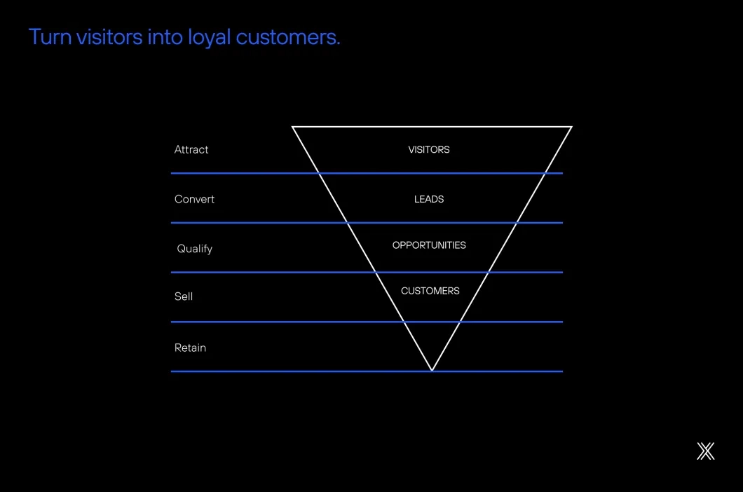
This is exactly the essence of a high-conversion website: a digital hub that combines user experience, targeted content, results-oriented design, and advanced technology, to turn visitors into customers.
But after all, what characterizes a website as "high-conversion"? And how can you transform your website into an active channel for lead generation and opportunities? That’s what we’ll explore next, in detail.
I want a high-conversion website
What is a High-Conversion Website?
A high-conversion website is one developed with a focus on measurable results, not just aesthetics. It’s designed so that each page plays a strategic role in the customer journey, from the home page to sections like "About," "Services," and "Contact."
Studies show that sites optimized for conversion can considerably increase lead generation rates compared to institutional pages without strategic CTAs. This happens because they combine branding (positioning and strengthening the brand) with performance (lead capture and conversion strategies).
In practice, this means visitors arriving at your site find relevant content, intuitive navigation, well-positioned offers, and ease to take action, whether by getting in touch, requesting a quote, or downloading exclusive material.
Also read: Before hiring: 10 characteristics of a good web company→
The starting point
A high-conversion website starts with the domain, which is the brand’s digital gateway and one of the factors that directly impact credibility, SEO, and user trust. A good domain should be short, easy to remember, intuitive, and aligned with the company’s name or the business’s main keyword, making it easier for visitors to immediately associate the address with what the brand offers. Domains with numbers, hyphens, or complex combinations should be avoided, as they complicate verbal sharing and increase typing errors.
For companies wanting to strengthen their digital presence, including strategic keywords in the domain can boost organic ranking, as long as this practice does not compromise the brand’s naturalness and strength.
In the table below, we gathered some basic examples of good and bad domains:
| Type | Example | Why it works (or not) |
|---|---|---|
| Good domain | booking.com | Short, direct, easy to remember, and self-explanatory. |
| Good domain | netshoes.com.br | Joins brand strength with the business niche. |
| Bad domain | minhaempresa-online123.com | Long, not very memorable, unnecessary numbers and hyphens. |
| Bad domain | ofertasimperdiveisparavoce.net | Too long, hard to type, little brand authority. |
How to build a High-Conversion Website?
Start with a clear strategy
Before thinking about design, it is necessary to understand who the target audience is, what the site’s objectives are, and the journeys the visitor must follow. This stage should unite marketing, technology, and design teams, potentially involving frameworks like Design Thinking.
Practical tip: working with multidisciplinary teams and understanding the target audience’s expectations significantly increases site engagement.
Offer an impeccable user experience
Investing in User Experience (UX) resolves aesthetic issues and plays a strategic role in boosting business. According to Forrester Research, every dollar invested in UX can generate up to $ 100 in return, highlighting the importance of this aspect for digital success.
An impeccable user experience involves three essential aspects:
- Intuitive navigation: A site with a clear structure, simplified menus, and logical flow eliminates barriers and confusion. This facilitates visitors quickly finding what they look for and advancing without obstacles, significantly increasing conversion chances.
- Optimized loading speed: Google data shows that 53% of users abandon pages that take more than 3 seconds to load. Slow sites frustrate users and harm search engine positioning. Optimizing images, using efficient hosting, and applying modern development techniques are fundamental steps to keep the site agile.
- Responsive design for mobile devices: With more than half of global traffic coming from smartphones and tablets, ensuring the site is fully functional and visually attractive on smaller screens is indispensable. Responsive design improves usability, reduces bounce rates, and broadens conversion opportunities on any device. Ensuring a fluid, fast user experience adapted to various browsing contexts is the foundation for turning visitors into loyal customers.
Deepen your knowledge: Why Inclusive Design is urgent →
Guide the user to take action
CTAs (Call-to-Actions) are indispensable elements to turn visitors into leads and customers because they guide the user to the next step in the purchase journey. Without clear and strategic CTAs, even a well-designed site can fail to generate conversions. They act as bridges between visitor interest and the desired action, whether filling a form, requesting a quote, or making a purchase.
A study by Sixth City Marketing points out that optimized CTA buttons can increase conversion rates by over 80%, showing their direct impact on results.

Best practices for effective CTAs:
- Be objective: Use action verbs like Request, Subscribe, Start.
Canva: Create your design now. A direct and simple invitation that clearly communicates what the user will do. - Create urgency: Phrases like Secure now or Last spots encourage immediate action.
Sephora: Get your free sample. A trigger of urgency and reward that motivates quick conversion. - Visual highlight: Use contrasting colors that catch attention without polluting the design.
Domino's Pizza: Order in 2 clicks. Besides the vibrant button color, the text reinforces speed, attracting immediate attention. - Maintain consistency: Align the CTA tone with the visual identity and language of the site.
Coursera: Start learning for free. The CTA reflects the platform’s value proposition and keeps coherence with its educational communication. - Place it in the right spot: Position CTAs in high-visibility areas (above the fold, at the end of strategic sections).
Booking.com: Check availability. Strategically positioned near filters and search results, facilitating immediate decision making.
Integrate SEO and inbound marketing
A high-conversion website is discovered organically, which is only possible when it applies Search Engine Optimization (SEO) techniques. To do this, it is fundamental to worry about site performance (Technical SEO), keywords and readability (On-Page SEO), and links to your site in other websites (Off-Page SEO).
Sites that produce content based on strategic terms attract more qualified visitors. However, it is necessary to understand the intent behind the search: whether users are exploring a problem, comparing options, or ready to contract.
For example, in the tourism sector, a visitor at the top of the funnel might search for "best family travel destinations," while someone closer to the decision will search for "all-inclusive package for Cancun in September." By mapping these journeys and aligning the content to corresponding keywords, the site becomes a magnet for qualified leads, connecting SEO directly to inbound marketing strategies.
Use data to continually improve
Tools like Google Analytics, Hotjar, and VWO can be used to monitor behavior, identify bottlenecks, and continuously adjust pages to increase conversion rates. Google Analytics provides essential quantitative metrics like traffic source, page behavior, and goal completion. Hotjar complements this view with heat maps, session recordings, and surveys revealing how users visually interact with the site.
VWO is an advanced optimization and experimentation platform: it allows A/B, multivariate testing, user segmentation, funnel analysis, and content personalization, all with intuitive visual editors and reports including Bayesian statistics in real time. With VWO, it is possible to test hypotheses, compare different versions of pages or elements, and identify approaches that truly increase conversions.
Practical tip: Combine Google Analytics goals (such as button clicks or form submissions), Hotjar’s visual insights, and VWO’s A/B tests and personalizations. This combination helps identify where users abandon pages, which elements perform best, and makes decisions effectively, minimizing risks and maximizing results.
Talk to a specialist and build your website now
Visual identity: the foundation for conversions
Obviously, it must be mentioned that a well-constructed visual identity is paramount for a website to be perceived as professional and trustworthy. Colors, typography, images, and graphic elements are important aesthetic resources because they communicate values, generate recognition, and create emotional connections with the audience.
A study by Lucidpress revealed that brands with consistent visual identity can increase their revenue by up to 33%, precisely because they convey trust and strengthen the user experience. This means that in a high-conversion website, the visual identity must be meticulously planned to reinforce the message at every stage of the journey, from the first impression to the final decision. Coherent design, visual clarity, and element harmony increase time on site, reduce bounce rates, and enhance user actions, turning visitors into qualified leads.
See, in practice, how major brands apply the main pillars of visual identity to strengthen digital presence and increase conversions.
Strategic colors
- Coca-Cola: Consistent use of red that transmits energy, passion, and urgency, strengthening the brand globally.
Coherent typography
- The New York Times: Classic and elegant typography reinforces the publication’s authority and tradition.
Visual consistency
- Apple: Maintains the same minimalist standard on all pages, products, and digital communications, creating a smooth experience.
Authentic and quality images
- National Geographic: Uses original and impactful photos that convey credibility and deeply engage the audience.
Visual hierarchy and spacing
- Slack: Bets on a design with great information hierarchy, well-distributed white spaces, and clear CTAs that guide users naturally towards action.
Beyond landing pages and blog articles
When discussing conversion, it’s common for companies to focus their efforts only on landing pages or blog articles. Although these play fundamental roles within an inbound marketing strategy, limiting the focus to them is a strategic mistake.
All website pages must be well thought out and built to: 1) explain who the company is; 2) highlight which products or services it sells; 3) generate conversions. After all, excellent content or a highly strategic landing page means little if, continuing the journey within the website, the user gets confused, cannot complete tasks, and loses interest in the brand.
A well-structured institutional website:
- Is the nucleus of the company’s digital presence: According to Think With Google, more than half of B2B purchase journeys start on an institutional website;
- Works as both showcase and funnel: While reinforcing brand identity, it leads users to actions that generate opportunities;
- Increases trust and authority: Studies show that 75% of users judge a company’s credibility by the site’s design.*
In other words, the site has ceased being merely a destination to become a bridge between branding and conversion, integrating different digital strategies and strengthening the entire marketing and sales ecosystem.
Why should integrated website construction start from the first step?
Despite the evolution of the corporate website’s role, many companies still treat its development as isolated and sequential steps: first design, then development, and finally marketing actions. This fragmented approach no longer works in today’s digital context, where speed, synergy, and results focus are essential.
Creating a high-conversion website requires full and collaborative integration from the start. Designers, developers, and marketing strategists must work together from the project conception to ensure every element is designed to generate real business impact. This synergy enhances user experience, maximizes performance, reduces rework, and accelerates delivery time.
At Dexa, this methodology is the basis of every project. By combining creativity, technology, and data from the very first meeting, we build websites that operate as intelligent conversion machines, aligned with companies’ commercial strategies.
Is your website really ready to convert?
If your website is not generating qualified leads or boosting sales, it is not fulfilling its fundamental role as an active channel for growth and relationship.
At Dexa, we help our clients reach this level, with personalized solutions that combine cutting-edge technology, conversion-focused design, and integrated marketing strategies.
Want to take your site to the next level and turn visitors into loyal customers? Talk to our specialists.
